pHathom
Visual Identity, Branding, Web Design, Front-End Development
A confident web presence to build credibility for groundbreaking CO₂ removal tech
pHathom is on a mission to reduce the massive buildup of CO₂ in our atmosphere by safely transforming it into something stable. Their breakthrough technology captures and converts billions of tons of carbon into bicarbonate that can be securely stored in the ocean, helping mitigate one of the planet's most pressing problems.
In a new phase of growth, they needed a credible and clear digital presence. Something tangible to move investors, scientists, and community members forward—a site that felt as real, science-forward, and thoughtful as the work itself.
We stepped in with just a few clear asks from the pHathom team: make it quick, make it editable, and keep it efficient. For some, those might sound like constraints. For us, it was a chance to do what we do best—build something strategic, structured, and sharp.
Smart strategy, fast execution
The website needed to do two things incredibly well:
- Clearly explain how the tech works, without overwhelming users
- Build trust with people who might want to fund it or utilize it
We led with a structured, component-based approach, drawing from our internal design system to accelerate the build without compromising thoughtfulness. This decision didn't just make the site faster to launch; it made it easier to maintain, adapt, and evolve over time.
Using proven, pre-vetted modules allowed us to spend more time on what mattered: shaping a cohesive brand experience, aligning messaging to the mission, and building a site that's both lightweight and impactful.
Starting off on the right tone
Even with templates in place, this wasn't just plug-and-play. The content led the design. We started with tone, collaborating closely with pHathom to land on a voice that felt confident, credible, and stripped of fluff. Then we mapped content priorities for launch, knowing that some pieces could evolve later as the story grew.
We kicked things off with collaborative working sessions to define two essentials:
- What kind of tone did we want to strike? Not just in the copy, but through typography, color, and overall feel.
- What content needed to be prioritized for launch? What would serve day one goals, and what could evolve over time?
Together with the pHathom team, we landed on a voice that felt confident, credible, and clean. From there, we workshopped key messaging, refined headlines, and tightened CTAs, ensuring every word moved people toward clarity, not complexity.
Tools to move the mission forward
What began as a straightforward website quickly expanded into a multi-part brand sprint to ensure consistency beyond the site. By the end of our collaboration, we delivered:
- A refined wordmark
- A modular, mission-aligned website
- Core brand guidelines (logo usage, color systems, and visual tone)
- Custom PowerPoint templates for team bios, data storytelling, and investor decks
These tools helped the pHathom team bridge the gap between web and pitch—arming them with assets to show up prepared and aligned, even in fast-moving conversations.
A wordmark with purpose
Before jumping into web design, we took a close look at the brand's wordmark. The original mark hinted at the periodic table—a natural visual entry point that aligned with the team's scientific approach and name. But the execution lacked clarity and structure, especially at small sizes.
We saw an opportunity to refine the mark in a way that would quietly reinforce pHathom's credibility. By tightening the letterforms, improving legibility, and introducing more balanced spacing, we brought visual order and strength to a brand rooted in science.
The updated wordmark feels clear, intentional, and grounded. When paired with the logo, it strikes a balance between professionalism and approachability—subtle but strong, just like the technology it represents.
Efficient and thoughtful design principles
Every visual decision was made with usability in mind. While the site used Niftic's component library, we customized the experience to support key interactions and messaging.
Core UX principles we applied:
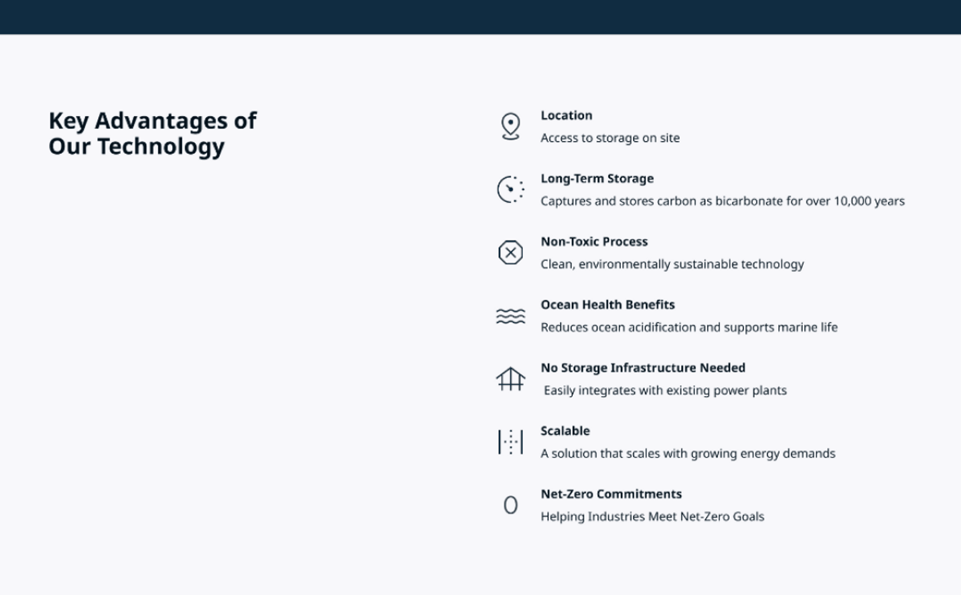
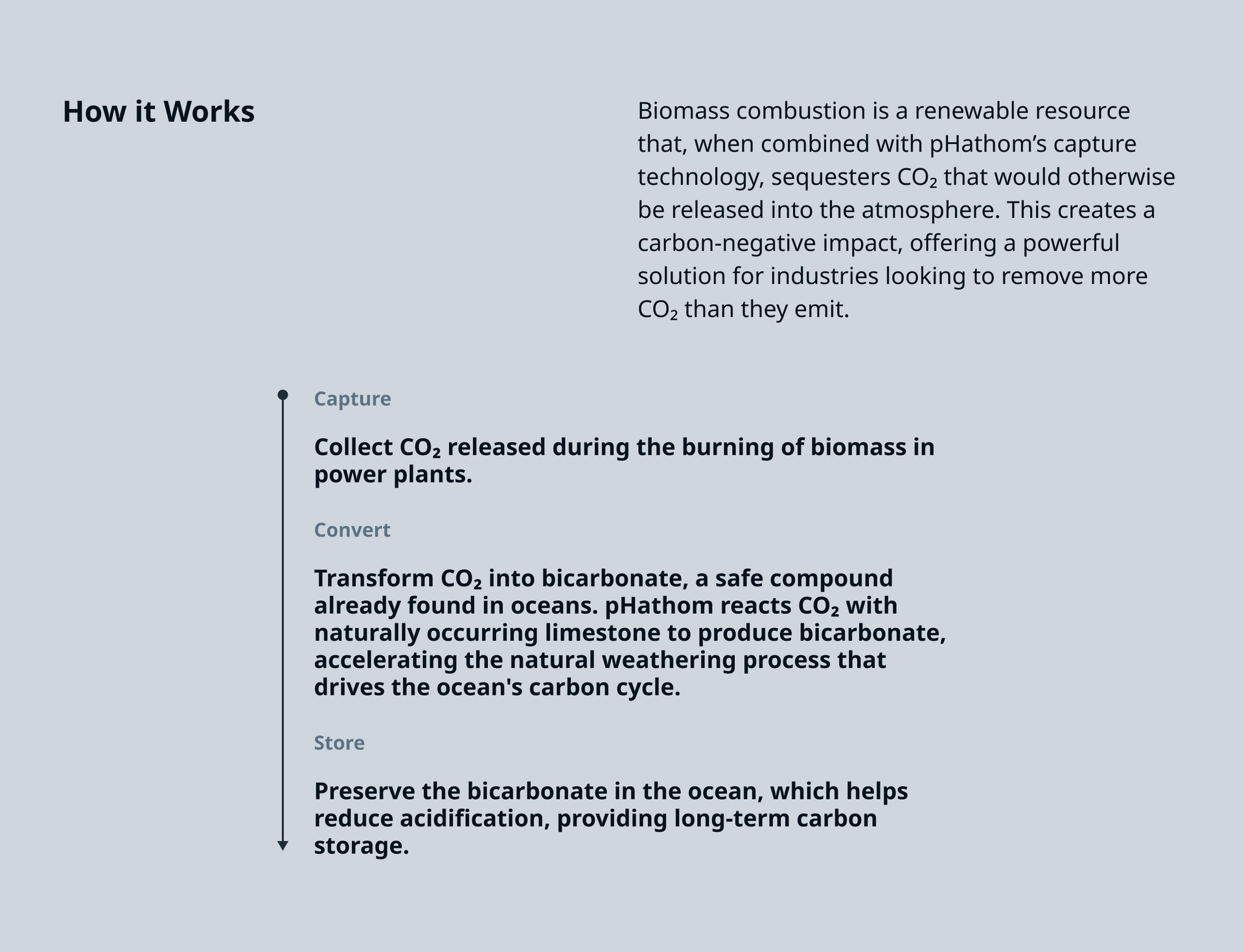
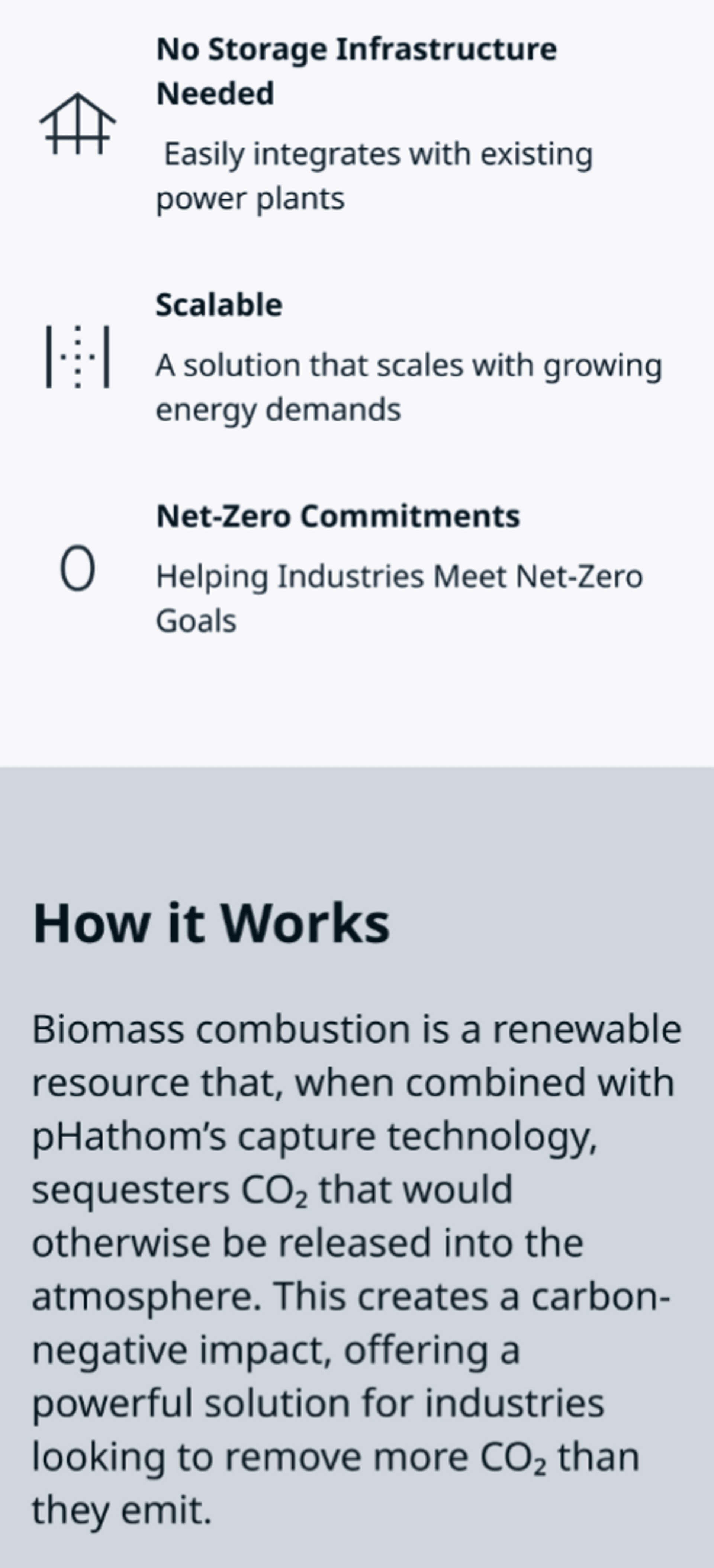
- Progressive Disclosure: Complex scientific explanations were structured into expandable modules, letting users choose their depth of engagement.
- Priming & Visual Cues: Icons helped draw attention to essential information and aided in digestibility.
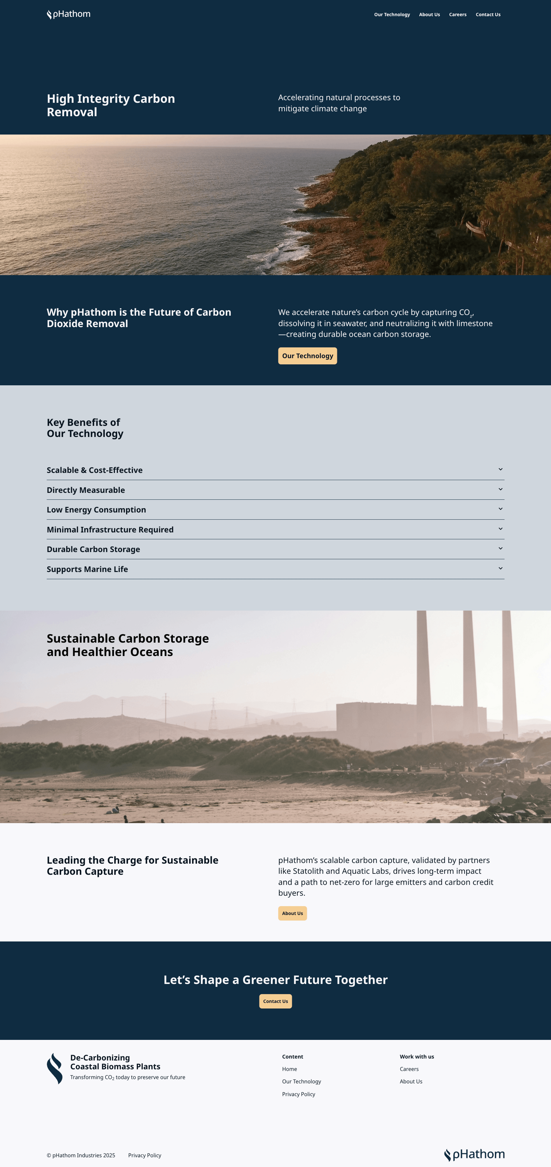
- Clear CTAs: Highlighted in a warm yellow against the cooler palette, calls to action were designed for clarity and movement.
The final palette—stately blues, soft neutrals, and warm highlights—was selected to reflect both the technical legitimacy and human mission of the work. We also curated a ready-to-use image library and visual assets to support future storytelling.
We also structured the website so that investors and stakeholders could move through the story easily, gain an understanding of the science, and leave with a strong sense of who's behind it.
Real, ready, and built to evolve
With designs approved, our engineering team moved quickly to bring the site to life. We built the site using our internal component system—an approach that streamlined development without sacrificing flexibility or polish.
Because the system is made up of well-tested, modular building blocks, it allowed us to:
- Move efficiently without reinventing the wheel
- Ensure consistency across screens and breakpoints
- Reduce technical debt by using scalable, lightweight code
- Make it easier for pHathom to update and expand the site over time
We handled everything from environment setup to deployment, ensuring a stable, secure foundation at launch. Once live, we walked the pHathom team through the CMS, provided documentation, and stayed on for a light-touch support window to cover any post-launch questions. This clean build gave the pHathom team exactly what they needed—something real, usable, and ready to grow with them.
For early-stage teams with bold missions, clarity is as important as innovation. This project was more than a website—it was a strategic sprint to build belief, invite partnership, and lay the groundwork for scaling a serious solution to a global problem.
And it's just the beginning.
Client
pHathom
Our Contributions
Visual Identity
Branding
Web Design
Front-End Development
Share Project
Ready to get started?
From brand to build, pHathom has the tools to tell their story, earn trust, and start scaling their mission fast.
Designing a logo that reflects the brand's vision with a progressive and distinctive bold lettering.
Design principles like priming guide users through complex ideas and provide extra context for increased comprehension.


The pHathom palette is inspired by the ocean, incorporating custom names that pay homage to the environment.


The refreshed wordmark puts clarity first, helping pHathom show up as serious, science-backed, and ready to scale.
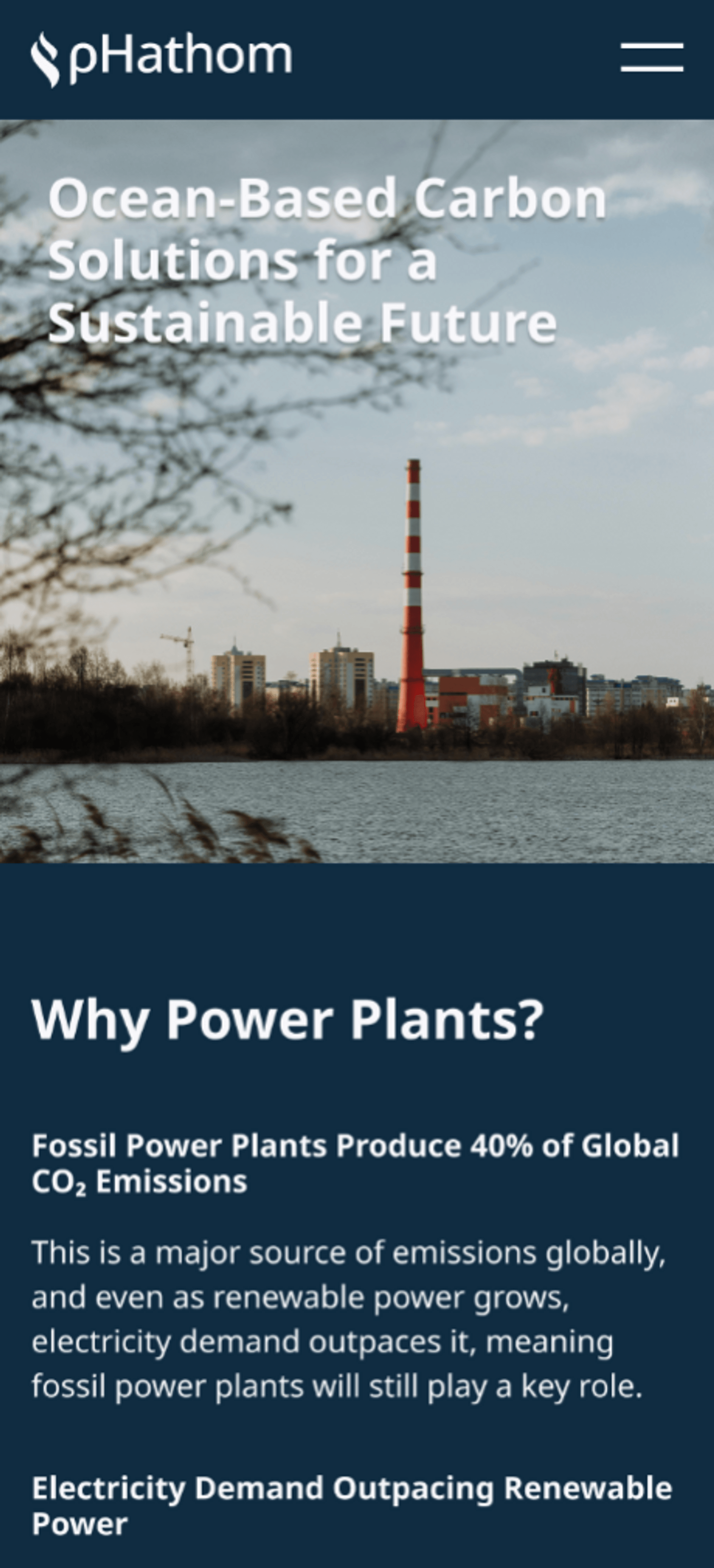
For an organization doing groundbreaking work in carbon removal, we paired clean visuals with curated photography to turn a complex idea into something tangible and trustworthy.