Kx Advisors
Brand Strategy, Visual Identity Design, UI/UX Design, Engineering
Redefining healthcare consulting with a bold identity and a modern digital experience

Recognized as a “Best Consulting Firm for Healthcare Consulting” 2020–2023 by Vault, Kx Advisors is a modern strategy consulting firm helping pharmaceutical, medical device, and health IT companies grow. Previously under Kaiser Associates Healthcare, the team had a bold vision for their breakaway brand.
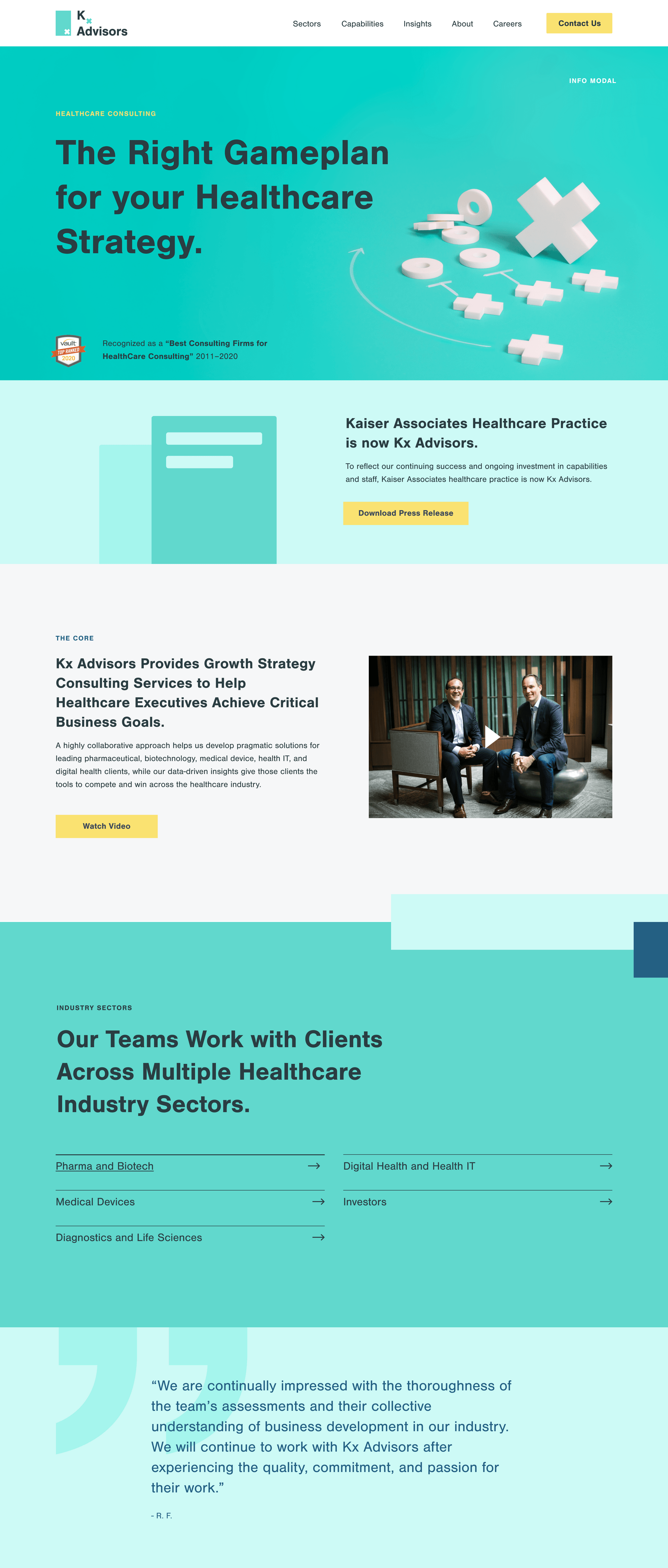
With the hopes to positively disrupt the status quo of global healthcare consulting firms, Niftic created a brand strategy and visual identity to position Kx Advisors as an industry leader. Bold and modern aesthetics help them stand apart, all while maintaining trust and credibility. The polished brand reflects their mission to deliver pragmatic and data-driven strategy solutions through high-touch and personalized experiences.
A visual identity as fresh and dynamic as the team
Kx Advisors needed a brand that felt as modern and differentiated as their approach to consulting. We built a design system that balanced confidence with approachability—eye-catching, yet warm; innovative, yet grounded.
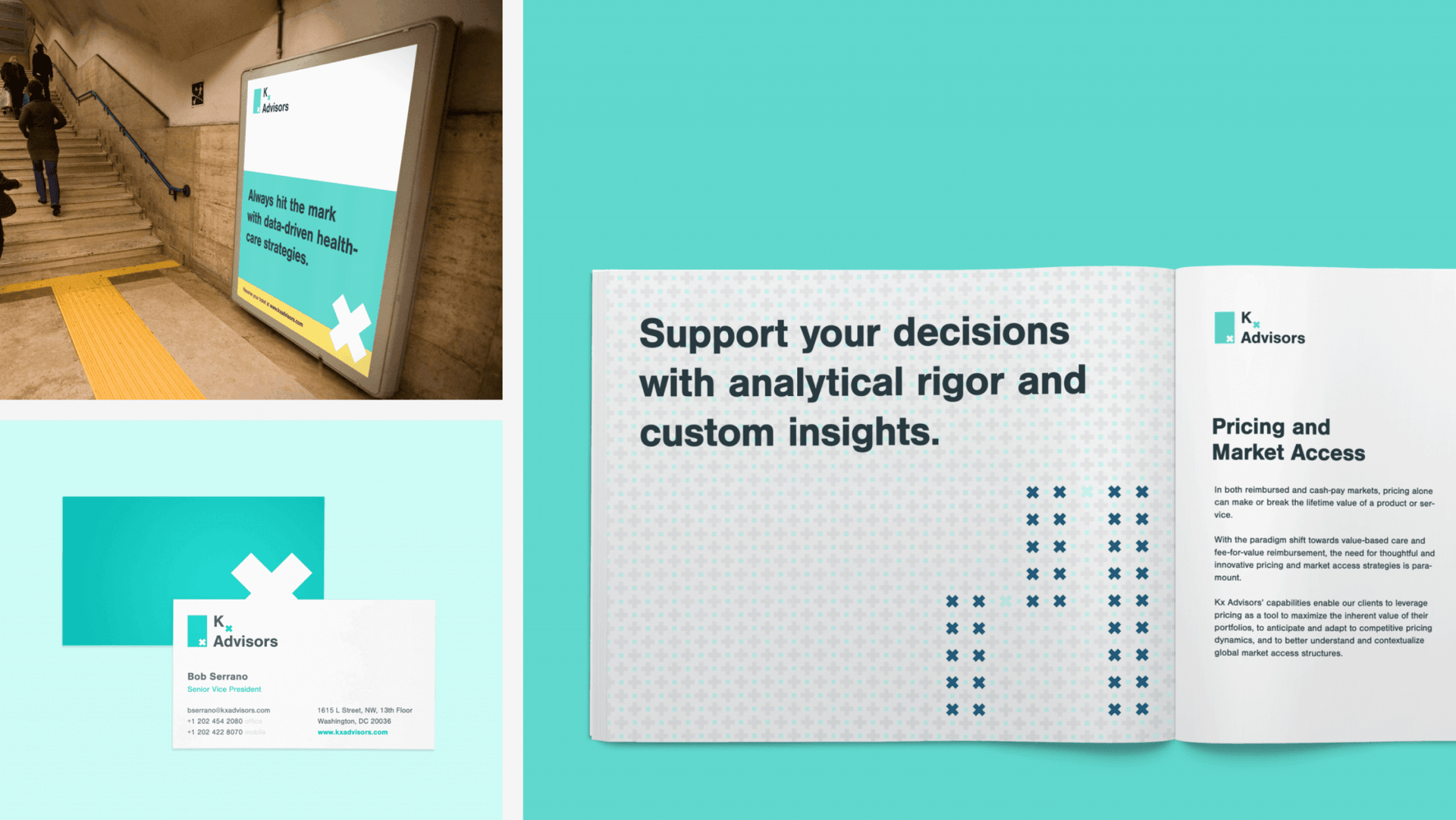
Their new logo is a nod to “℞”, paying homage their parent company while marking a distinct evolution. Color-blocked overlays and photography give the brand a distinctive energy, ensuring Kx Advisors stands out in a field known for playing it safe. And while the visuals are dynamic, they remain professional and capture their B2B expertise.
Photography as custom as the Kx experience
The Kx team delivers strategy with a high-touch, personalized approach, and their brand visuals needed to reflect that. Instead of relying on stock imagery or sterile corporate photos, we built a bespoke photography style that brought their signature ‘x’ marque to life in a deep, interactive way. A cohesive style and art direction fuses makes the brand consistently memorable.
At its core, Kx Advisors is all about adaptability. Their ability to pivot, refine, and rethink strategy in real-time sets them apart. Their responsive brand symbol reflects their agility, evolving seamlessly across different applications while reinforcing their market leadership.
Client
Kx Advisors
Our Contributions
Brand Strategy
Visual Identity Design
UI/UX Design
Engineering
Share Project
Ready to get started?
A bold, dynamic logo incorporates color-blocking elements and embodies a differentiated look while maintaining professionalism and history.
Learn about this project’s strategy


“Strategically-aligned creativity is something that they are really good at.”
—Bob Serrano, Senior VP of Kx Advisors


Kx Advisors’s photography style integrates the signature ‘X’ marque into dynamic compositions, highlighting the firm’s expertise across sectors and reinforcing the brand’s adaptability and industry-wide impact.

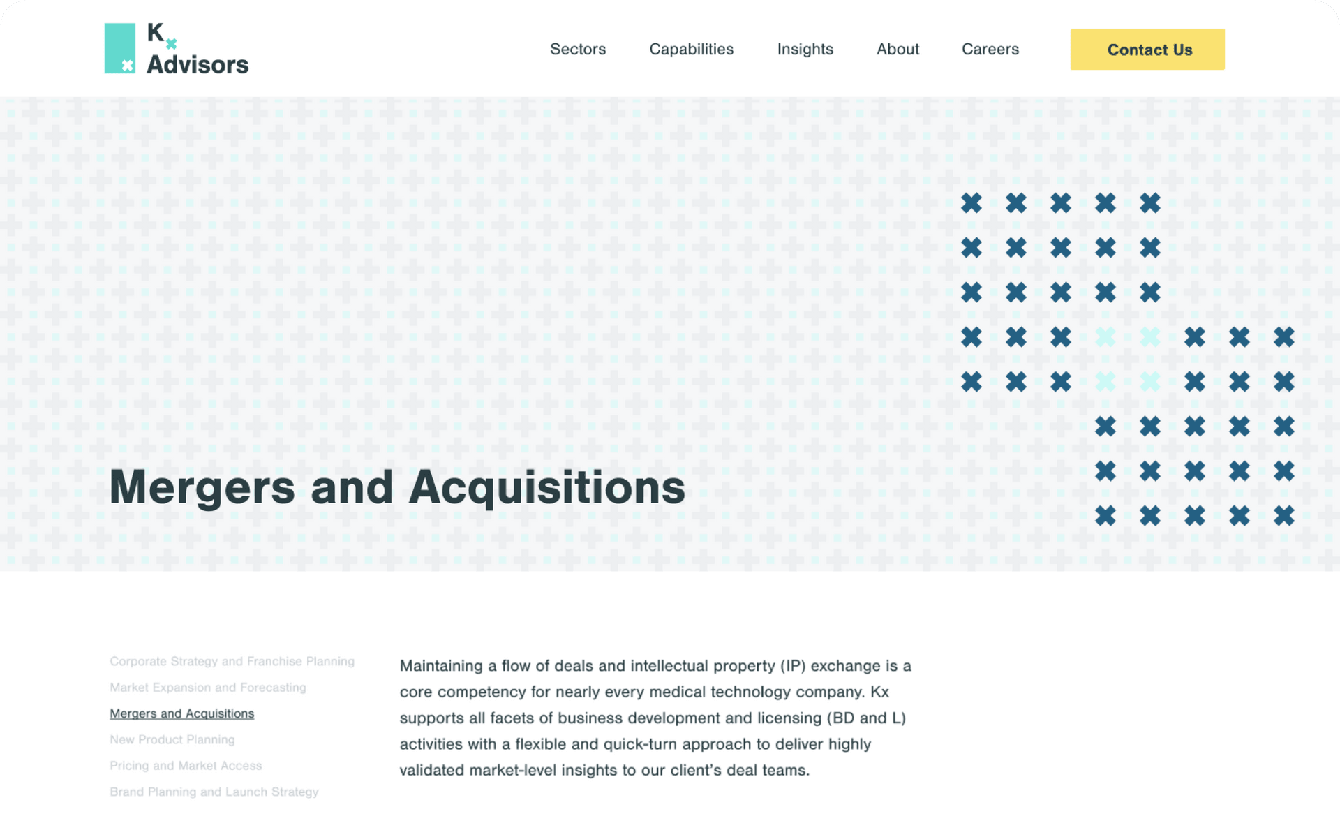
We opted for a 2-column website layout for ease of navigation and an approach designed for content expansion and flexible use.

We incorporated the symbol into the digital experience in a responsive and expressive way, through evolving patterning and animated design accents.

Modern art direction and photography brings the signature brand mark to life in a deep, interactive, and memorable way.
