Salt Lake County
Digital Strategy, UI/UX Design
A website restructure to improve the user experience and build genuine connections
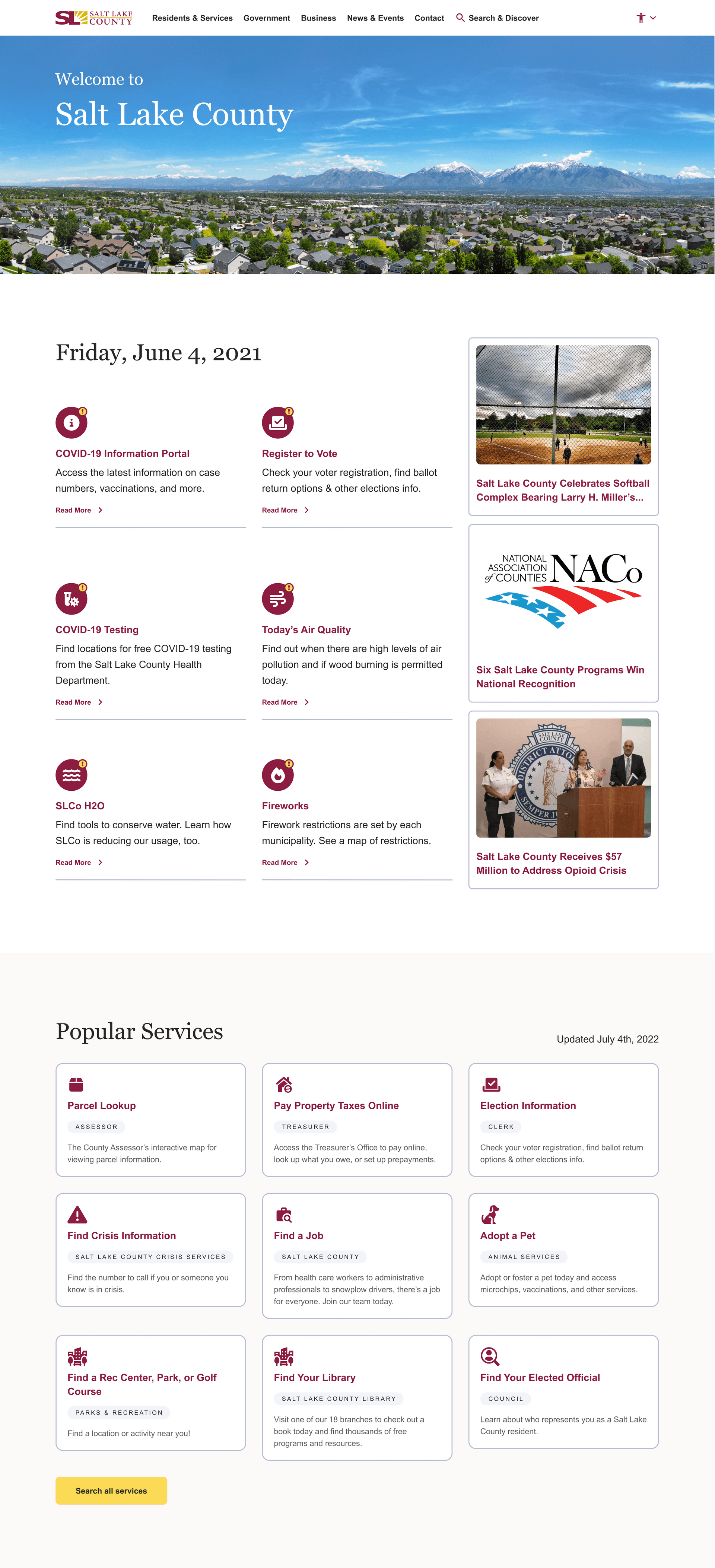

With nearly 80 departments and over 100,000 pages of content, the Salt Lake County (SLCo) website was sprawling, fragmented, and inconsistent. Different departments used different layouts, systems, and even color palettes, making it hard for residents to navigate or find critical services. Users needed to understand the County’s internal structure in order to access the information they needed.
Niftic was brought in to reimagine the SLCo digital experience from the ground up: creating a service-focused, unified, and accessible design system that could serve millions across every department, every need, and every ability.
A design-thinking approach at scale
Niftic kicked off the project with an in-depth discovery phase, gathering thousands of user surveys, conducting navigation and video testing, mapping historical traffic patterns, and leading nearly 100 interviews and focus groups. These insights helped define the strategy for a restructured experience that put the user at the center, starting with simplified navigation and a flexible, consistent design system.
One system for 80 departments
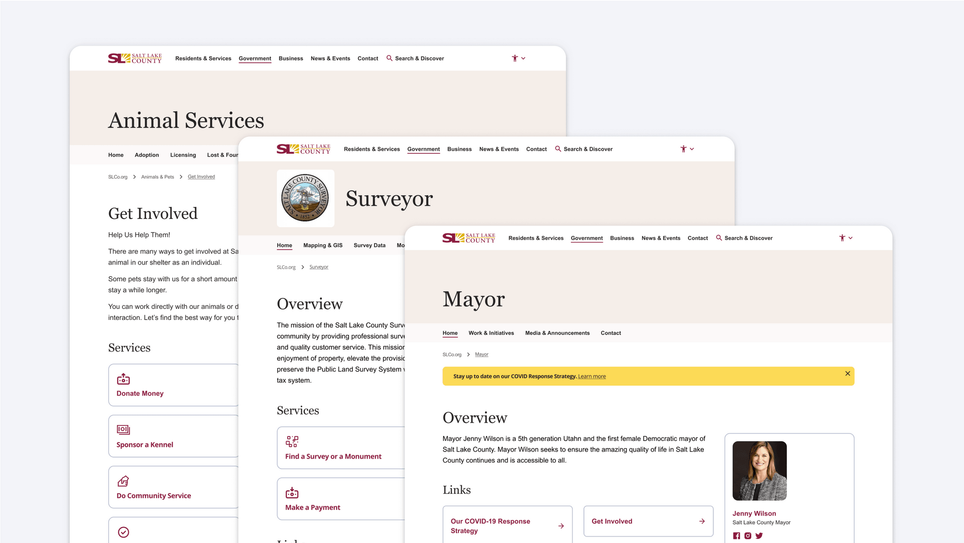
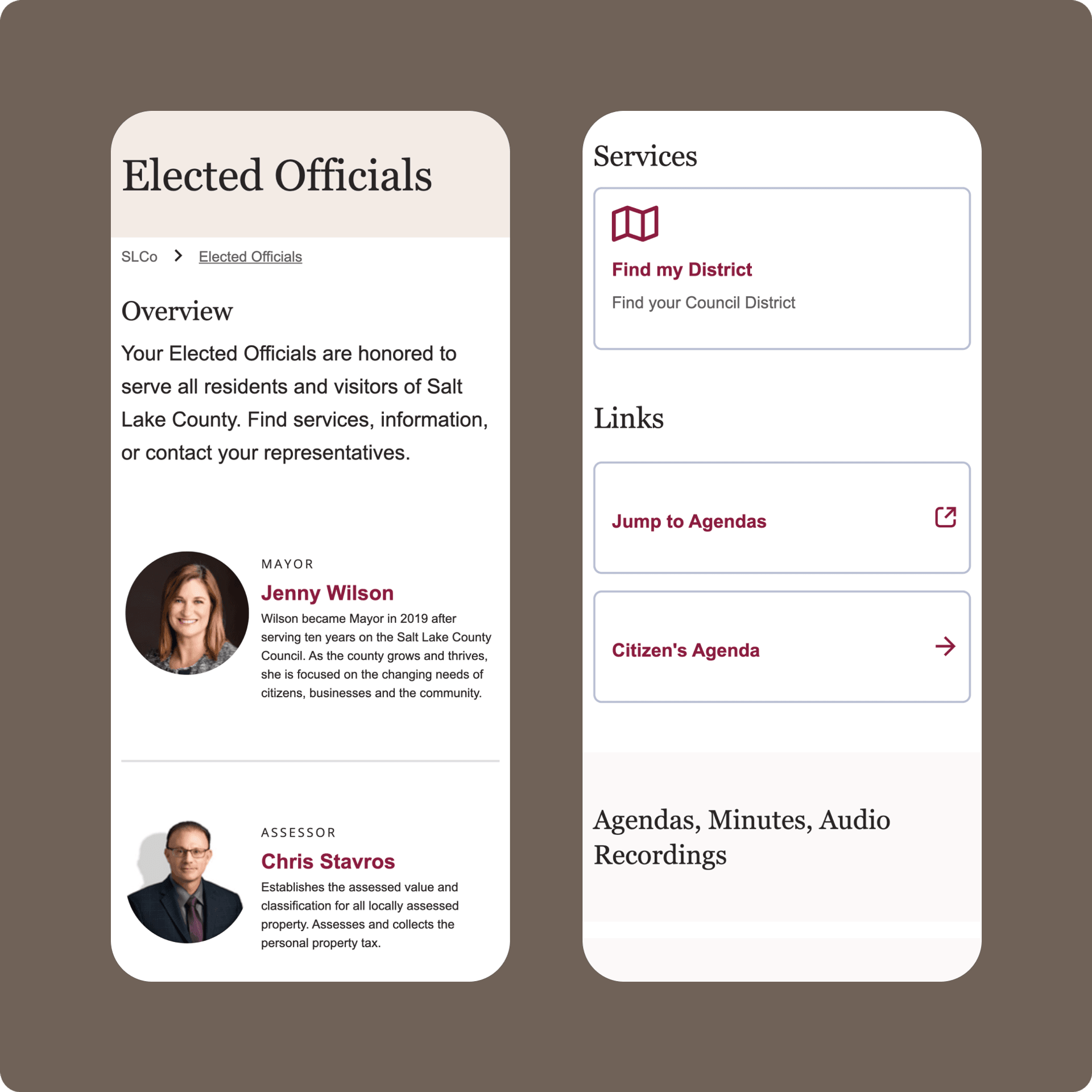
From public health to parks and recreation, every department needed to retain its unique purpose while fitting into a unified digital language. Niftic collaborated closely with each team to design modular templates and components that honored the County’s brand trust while staying adaptable to a wide range of content. The design system was also built with accessibility baked in, ensuring all users, regardless of ability, could confidently find what they needed.
As departments prepared for launch, Niftic supported the County with content strategy, quality assurance, and guidelines that empowered teams to manage their pages with confidence. Working hand-in-hand with the internal development team, updates were rolled out in phases, ensuring performance and consistency every step of the way.
By rooting the work in user needs and close collaboration, Niftic helped transform Salt Lake County’s sprawling digital ecosystem into a streamlined, intuitive, and inclusive platform. The new design system is fresher and functions better for the people it was built to serve.
Client
Salt Lake County
Our Contributions
Digital Strategy
UI/UX Design
Share Project
Ready to get started?
Utilizing a strategic design thinking process to drive product-led growth and user experience.
Learn about this project’s strategy
We worked with nearly 80 individual departments to identify areas for content consolidation & more efficient user flows to reach page content efficiently.
The updated layout is based on user interest and preferences, identified and verified through user testing, data, and analytics.
Learn about this project’s strategy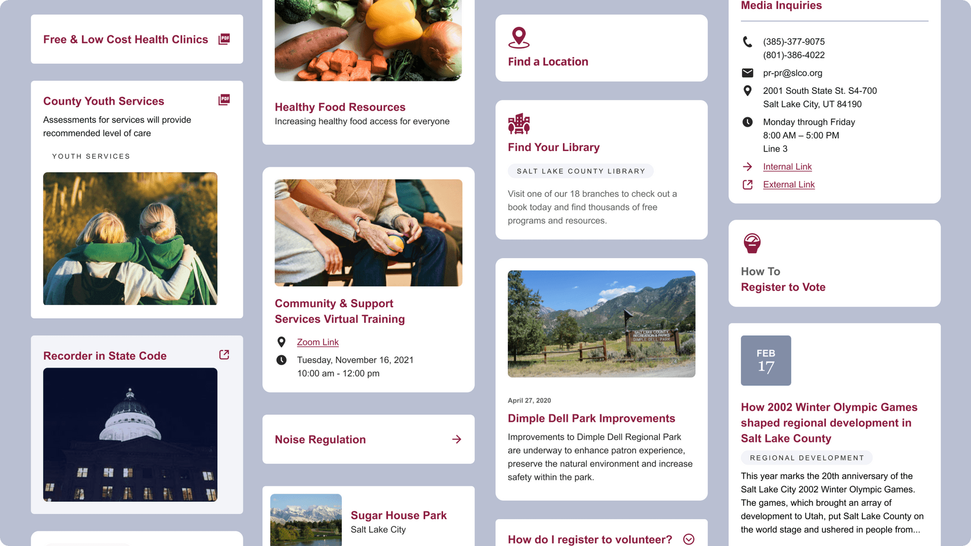
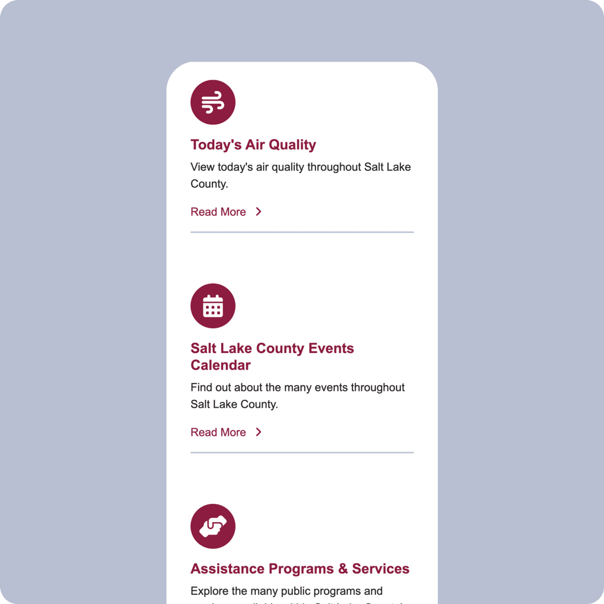
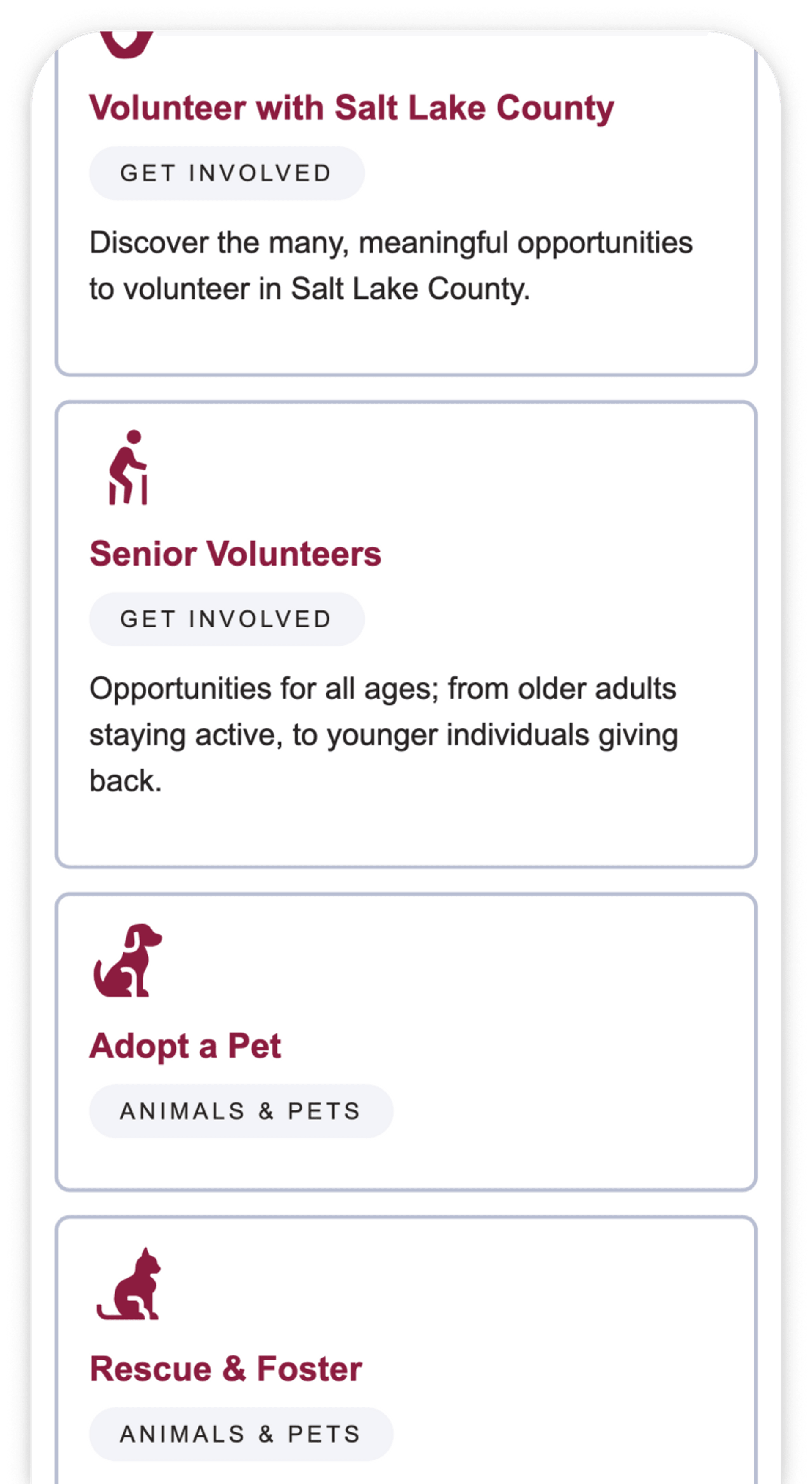
The new card-based system provides a balance between flexibility for a wide range of content needs and structure for consistency throughout the site.


Increased accessibility and speed of wayfinding through custom icon systems.
Learn about this project’s strategy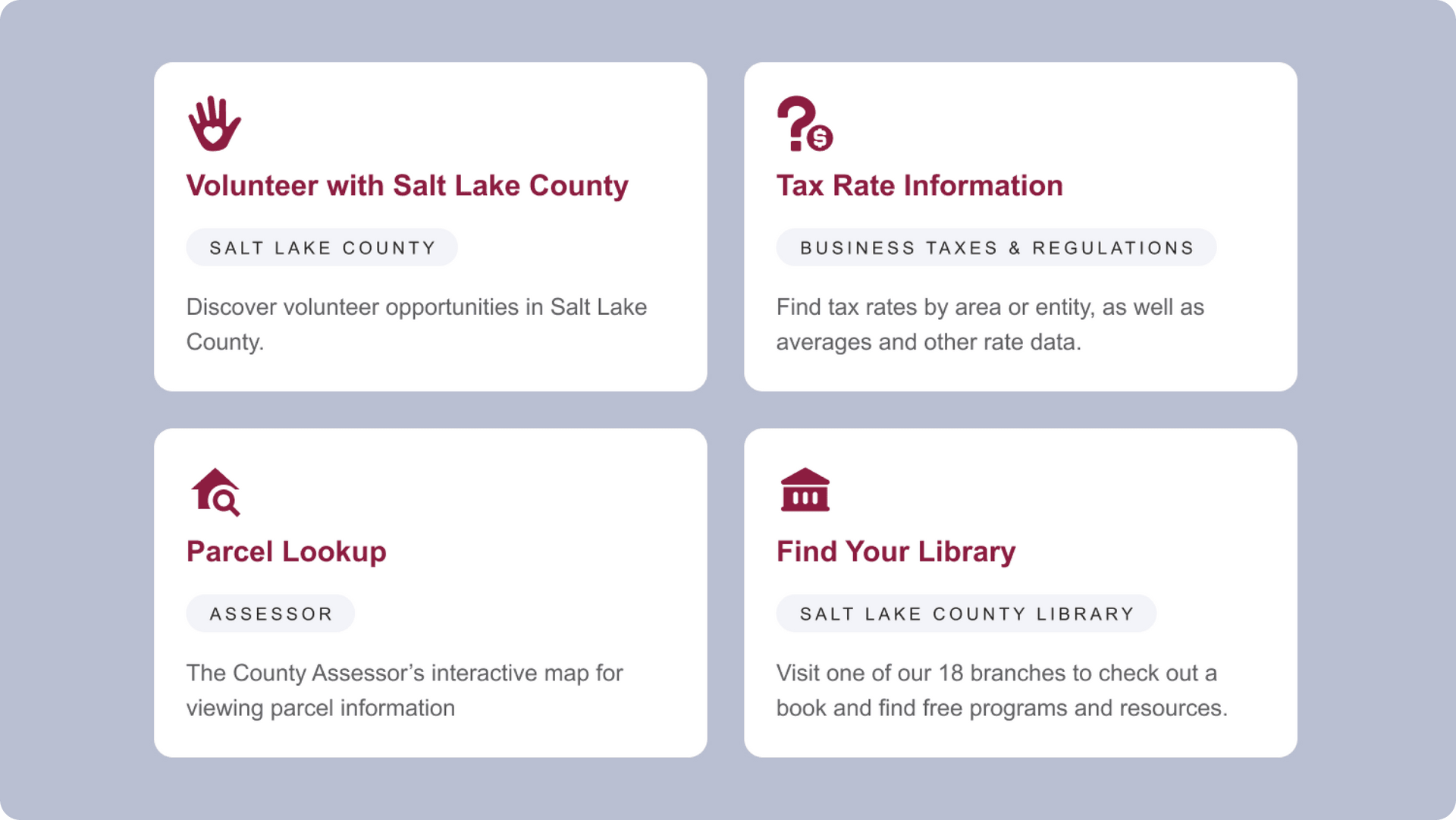

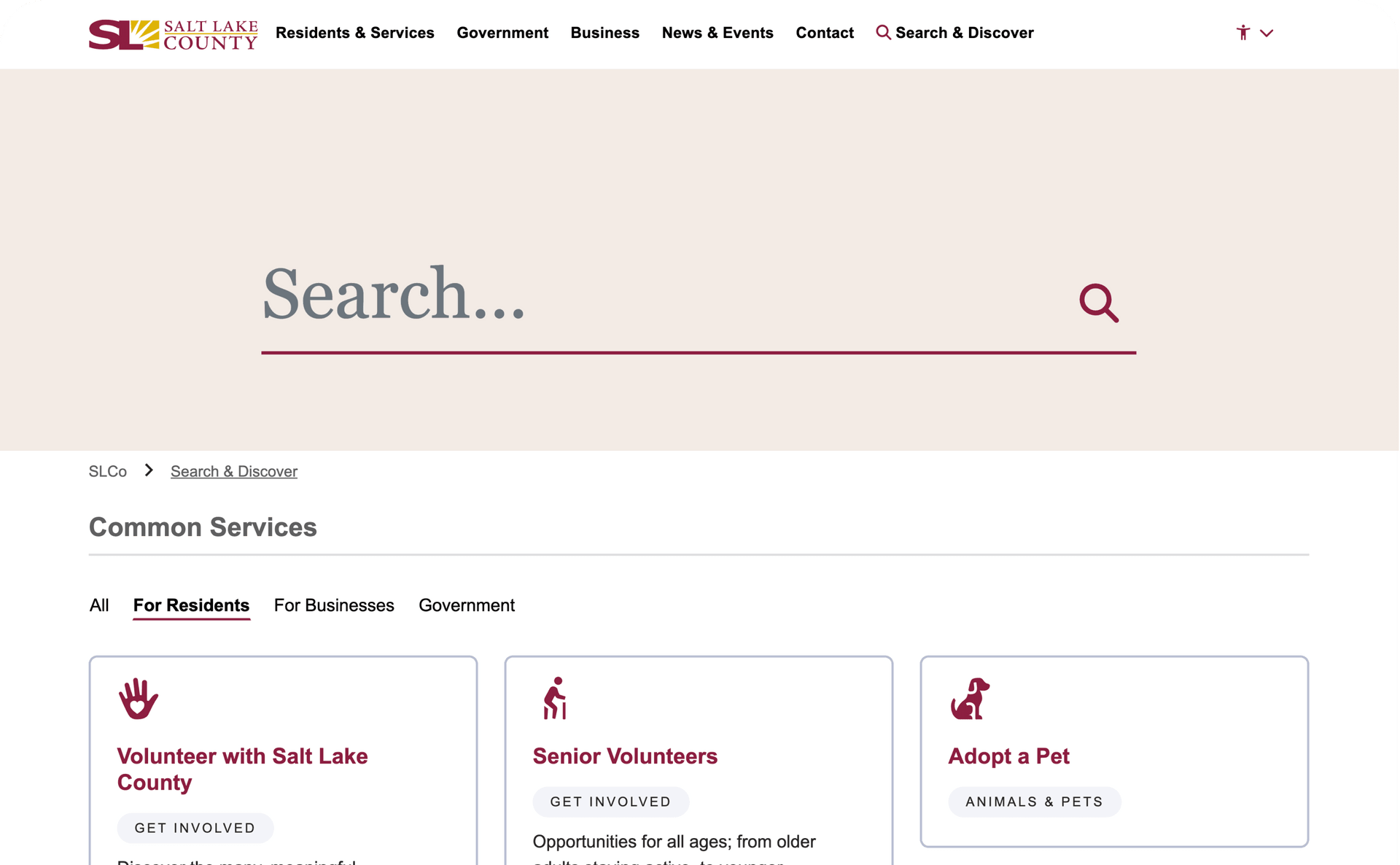
A focused, dynamic search suggests content and services to users based on their location in the site.
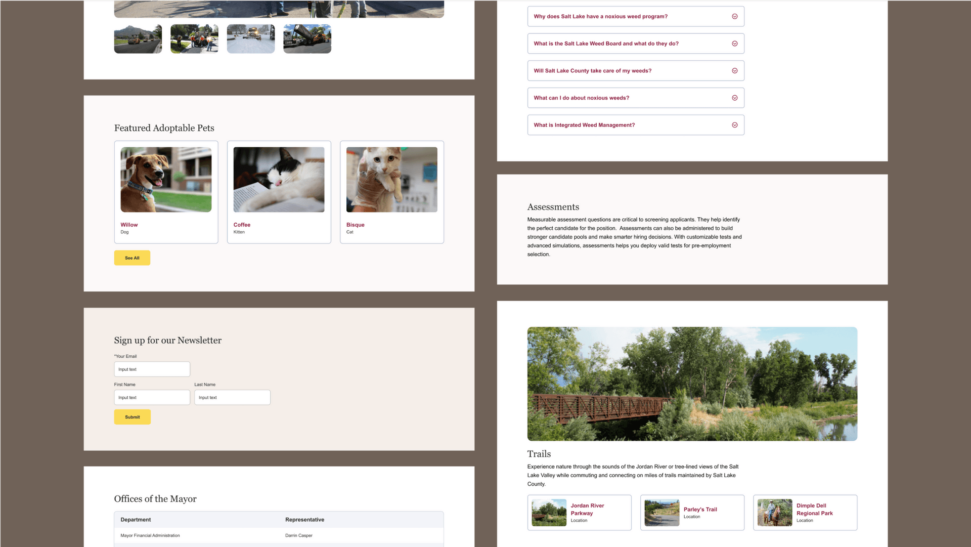
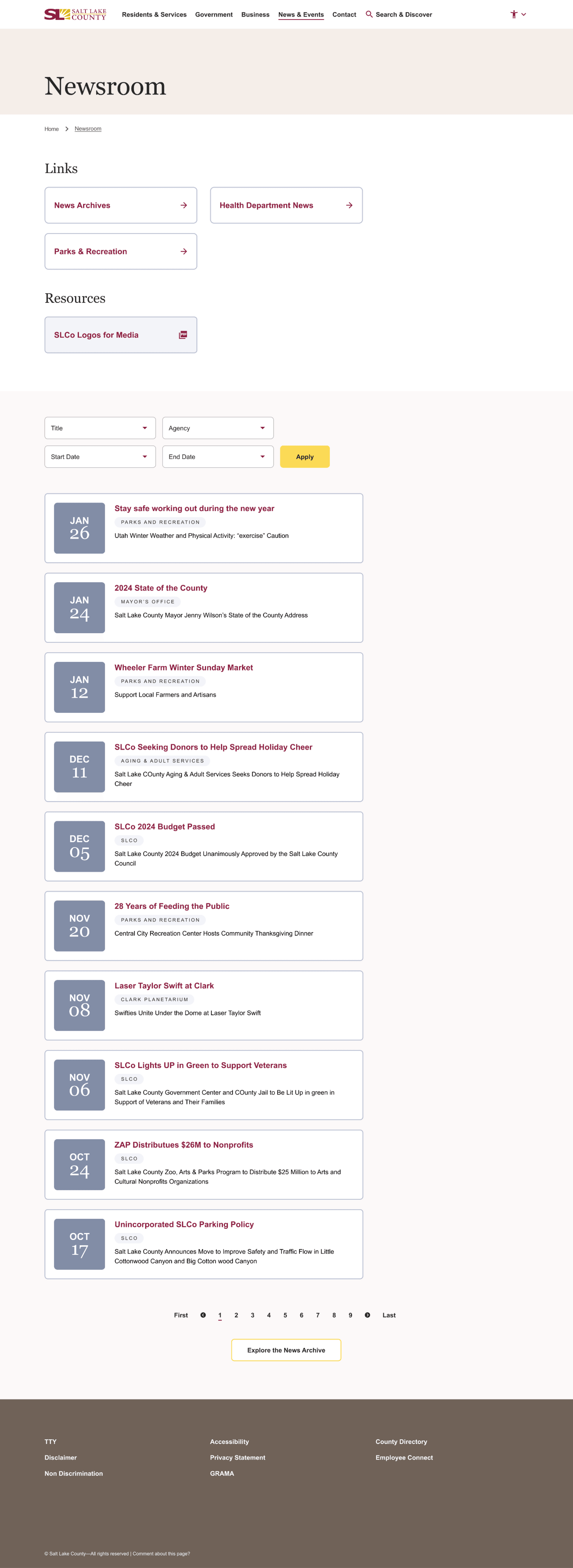
Consistent design components and templatized pages allow users to learn the system faster and utilize it more effectively - even with a vast variety of services, information, content types, and needs.
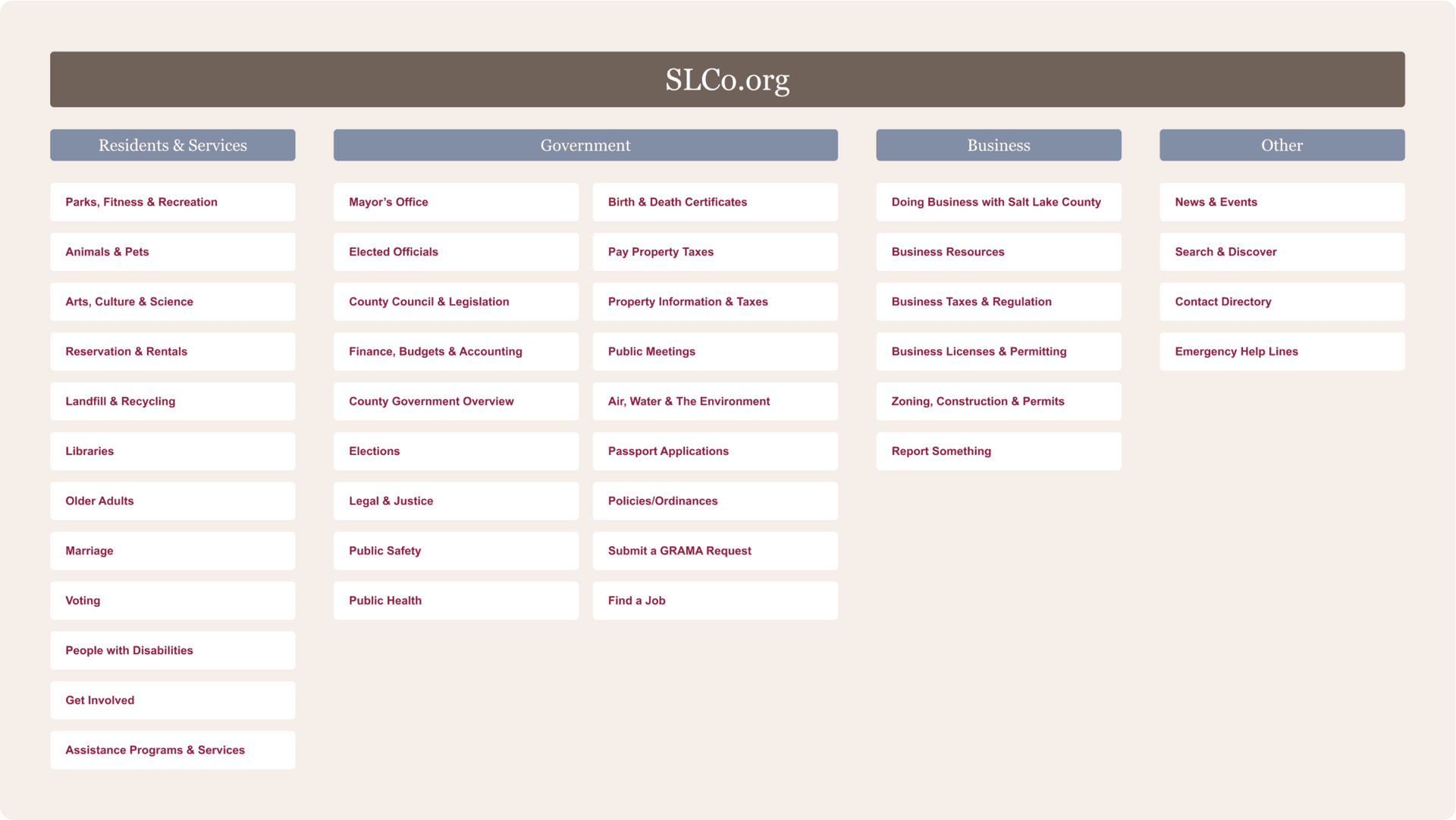
A simplified, user-tested navigation structure allows for intuitive command of the site.