Algernon
Brand Strategy, Marketing Strategy, Messaging, Visual Identity, UI/UX Design
Giving a face to an invisible clinical intelligence AI
Most tech brands aim to be noticed. Algernon wasn’t one of them.
Created by former clinicians and engineers who’d seen the cracks in behavioral health systems firsthand, Algernon wasn’t built for flash. It was designed to run quietly in the background—monitoring data, flagging clinical risks, streamlining workflows—so real people could spend less time managing systems and more time caring for patients.
When Algernon came to us, they were a small team with deep convictions to close the cracks in behavioral health. No overstating or over-marketing. They just wanted to help where help was most needed. However, how do you brand something that’s meant to stay invisible?
Behavioral health is a complex space, and there’s no single decision-maker. Clinicians need to see how it’ll make their day easier. Finance teams need proof it’ll pay off. Compliance officers need to see how it holds up under pressure.
So we built a brand strategy that could speak to all of them calmly, clearly, and without losing the quiet heart of the product.
Building trust by meeting people where they are
Messaging is typically viewed as a hierarchy. But in this case, it made more sense to approach it more as a flow. Every step of the messaging system solves for the real-world decision chain, so we started where it mattered most:
Clinicians: Show how it’ll help them and that it’s coming from people who’ve been there.
Finance: Make the case with numbers, like less time wasted, fewer errors, better resource allocation, etc.
Compliance: Reassure them from the start that it’s secure, audit-ready, and pairs well with existing systems.
This is an empathic strategy in action. The tone was candid and clear. We steered away from jargon and posturing so common in health tech. The goal wasn’t to simply sell but to help people finally feel seen and supported.
This strategy became the foundation for the brand and the concept that guided all creative: The Invisible Assistant.
Design decisions that made Algernon real
Every creative decision followed the brand's approach of silent support. Subtle, thought-out design elements that would earn trust.
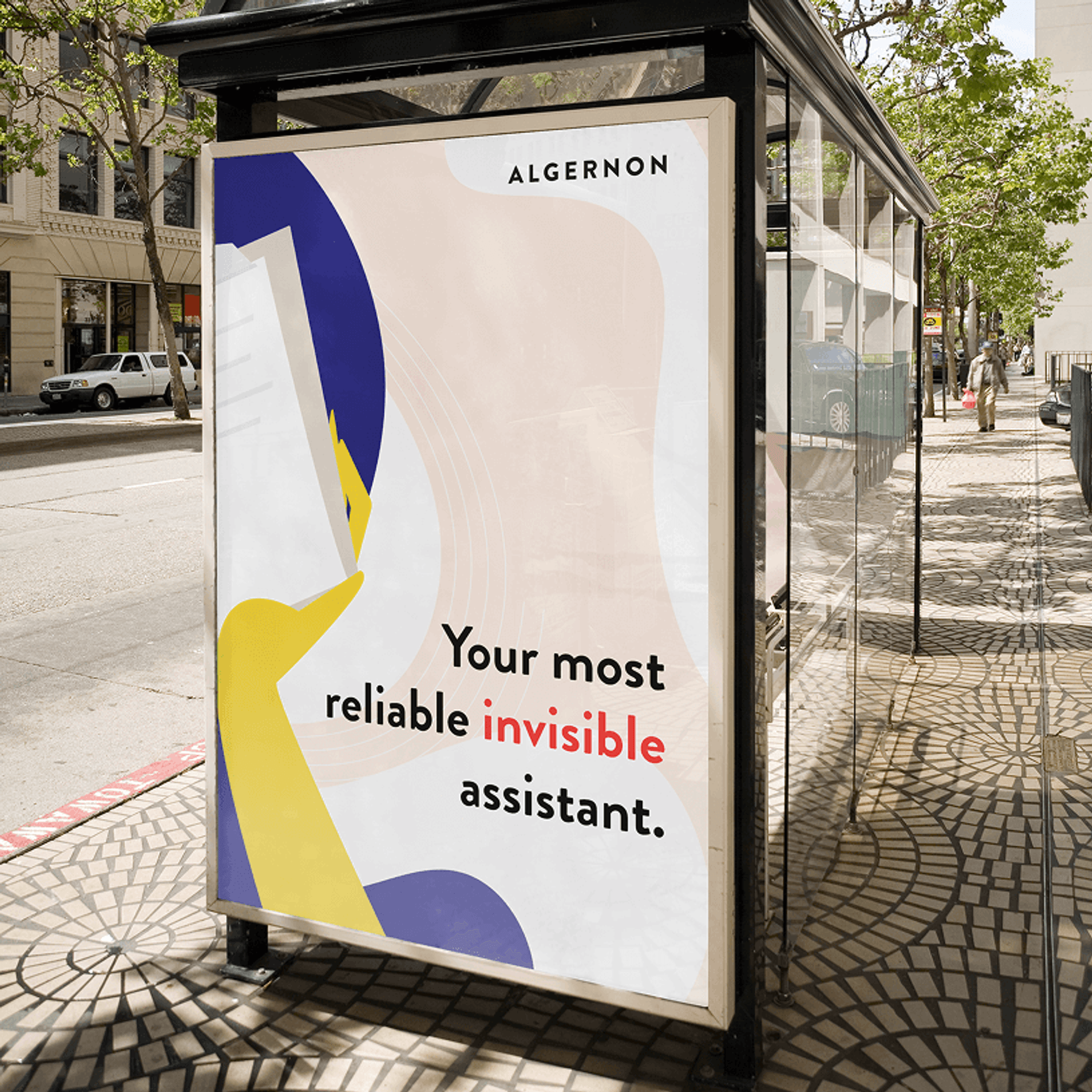
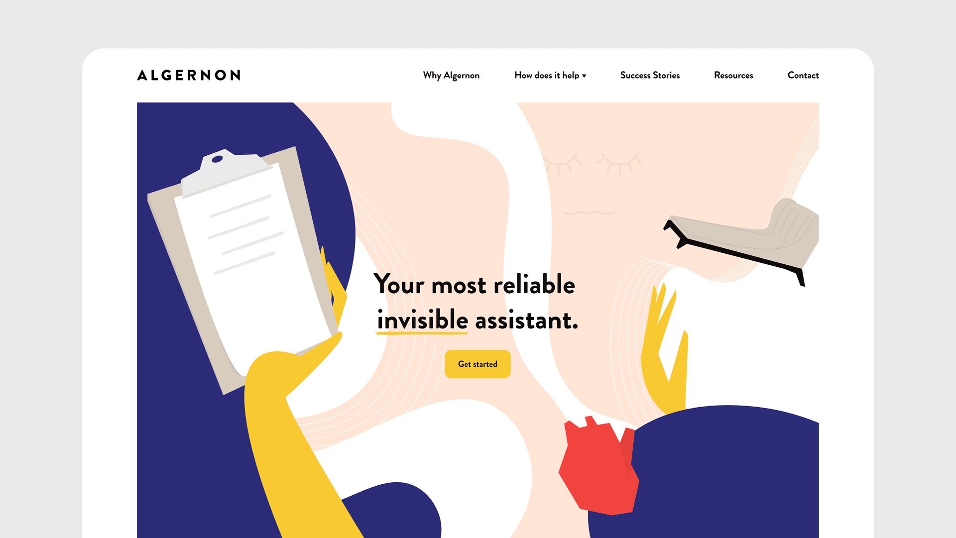
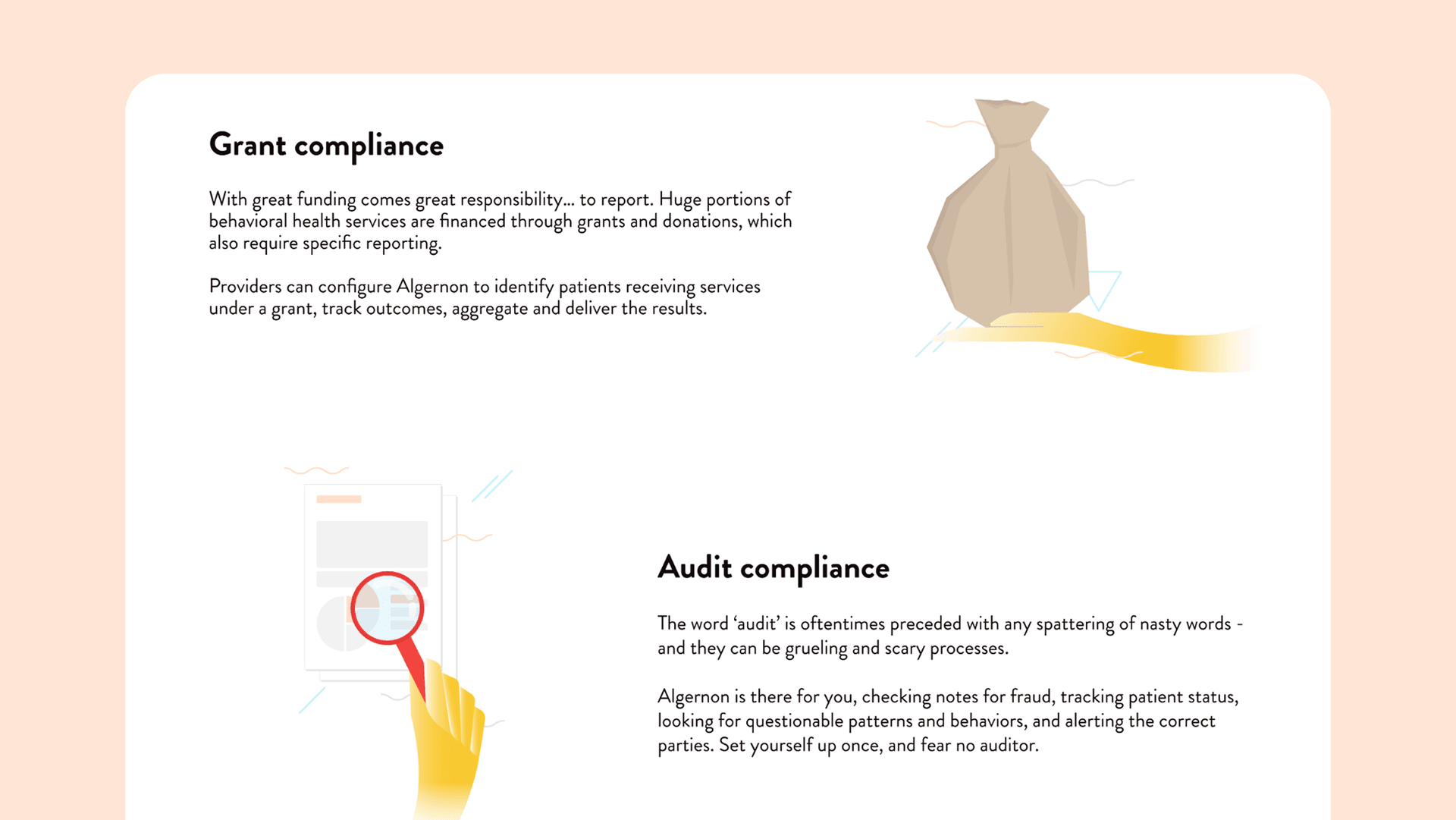
Hands, not faces
We used illustrated hands throughout the system because they’re broader, hold no true identity, and can represent a multitude of people. Hands hold, pass, and guide. They work in the background, just like Algernon. There are no heroes or victims here. No mascots or emotional manipulation. Just clarity, empathy, and care.
Invisibility as integration
The visual identity was intentionally understated. Abstract figures, softened backgrounds, and minimal motion blend seamlessly into the product itself. Incorporating invisibility wasn’t necessarily to instill a feeling of absence rather integration.
Where most brands would want to play with ways to lock in all the attention, Algernon avoids visual differentiation that could subconsciously jar the audience. It purely exists to support and not stand out in the traditional sense.
Color with intentional emotional complexity
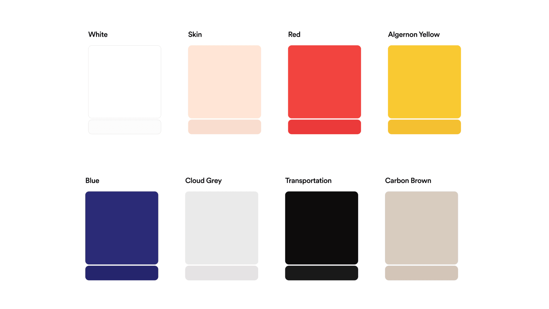
At first glance, the palette is warm and slightly playful. But this is not to mistake the palette as something naive or one-dimensional. The colors told their own story of duality:
Surgical white and ash grey: This color, often synonymous with the medical field, subconsciously builds trust through credibility. It also evokes precision and control by being clean and untarnished.
Peach, red, and yellow: These warm colors offset the white and grey, connecting to the brand’s humanity and energy.
Cool blues: Everything is tied together with the cooler blues. Acting as a stabilizing force for their visual identity, it’s a calming connotation that adds clarity to the message delivery.
The palette mirrors the clinician-patient dynamic: seriousness held in care. There's no single mood here. It's a full spectrum of what behavioral health actually feels like.
Typography as tone
Brandon Grotesque struck the perfectly imperfect balance: geometric but approachable, modern but warm. But it doesn’t stop with just choosing the right type. It’s also about what you do with it from there—or what you don’t do with it. We kept the system tight and the rhythm purposeful. No unnecessary variation. That’s knowing your tone—and brand—and sticking to it.
Why it mattered
Behavioral health work is often invisible. So are the tools that support it. Algernon was designed to carry the weight that shouldn’t fall on clinicians in the first place. Our job was to give that quiet support a voice and presence without ever being too loud.
Algernon was a quiet revolution in behavioral health. We’re proud to have given Algernon a way to express that conviction. The result was a brand that could stand confidently in rooms filled with skepticism and be remembered.
We don’t know where Algernon landed. After an early fundraising push, they went quiet. They may have pivoted. They may have walked away. But we still think about the work—and the people—often.
What we built with them was worth building and still stands as one of the clearest examples of what a brand can do when you lead with humility and strip out the ego. And when passion truly is the driving force.
Client
Algernon
Our Contributions
Brand Strategy
Marketing Strategy
Messaging
Visual Identity
UI/UX Design
Share Project
Ready to start your next project?
Algernon’s brand reflected its quiet purpose of supporting clinicians behind the scenes without ever demanding attention.
Learn about this project’s strategy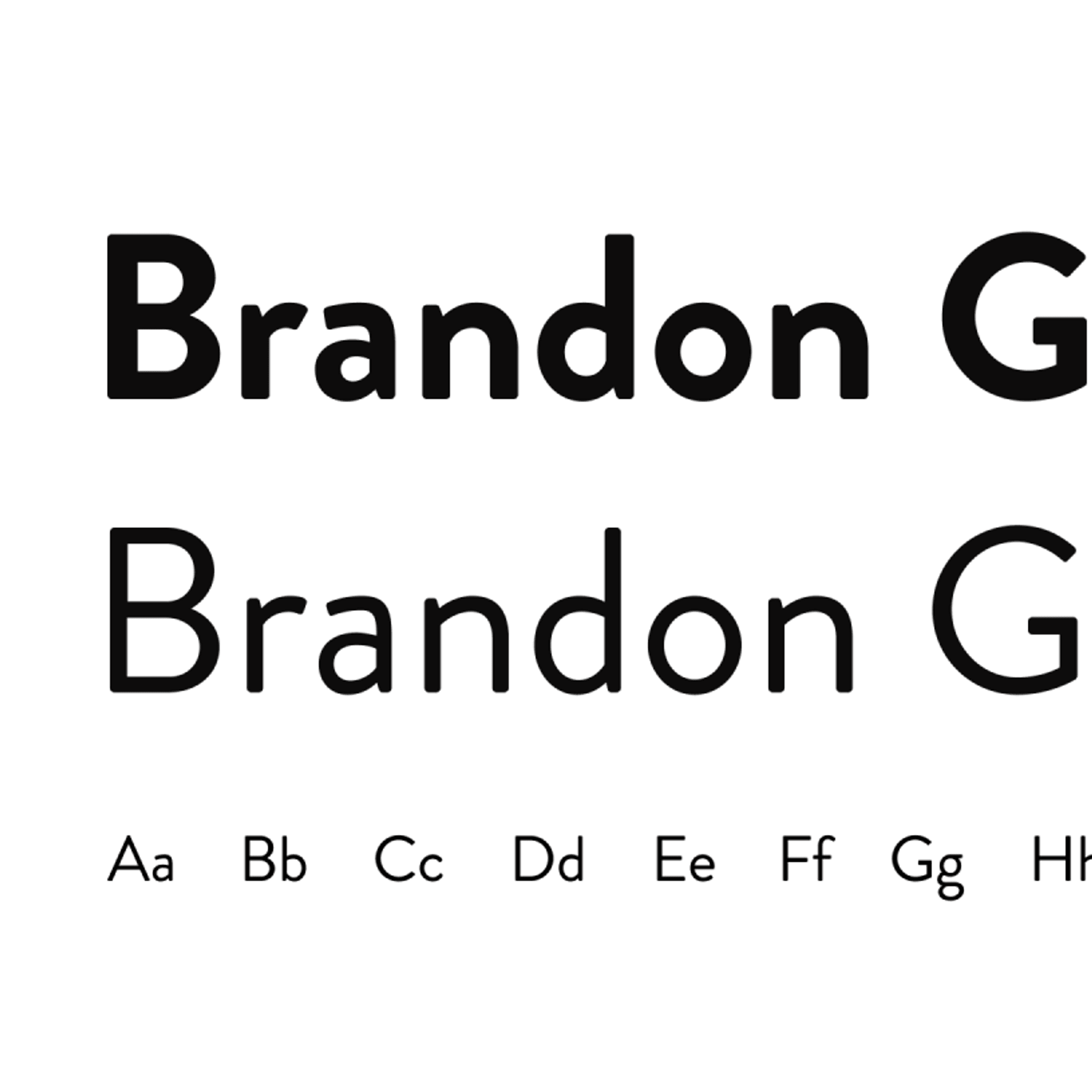
Brandon Grotesque struck the balance we needed: modern yet warm, structured yet human. A typeface that spoke volumes by staying quiet.

We built a visual system that blended in on purpose. Subtle motion, softened shapes, and a restrained palette made the brand feel like part of the product.

Illustrated hands replaced faces to avoid emotional manipulation, emphasizing action over identity and keeping the focus on collective care.
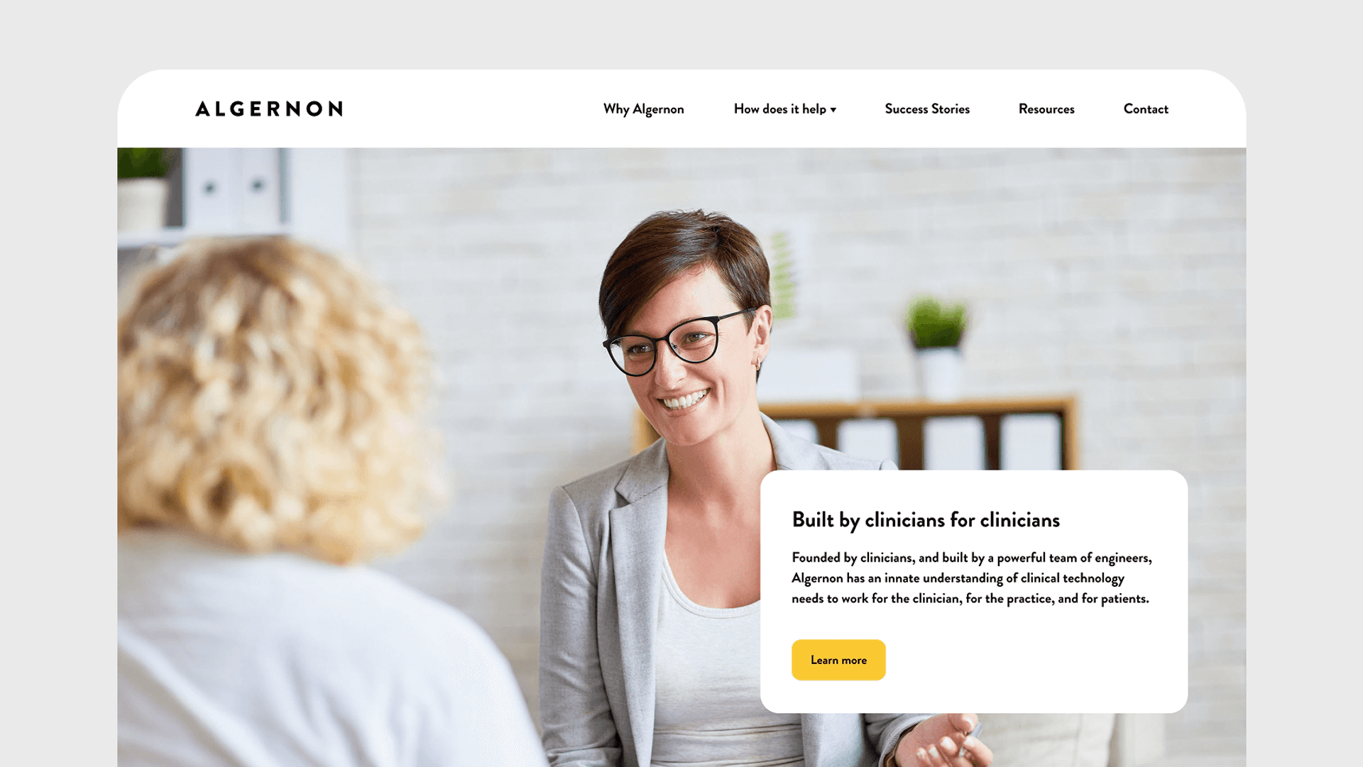
Algernon was built to support. Every detail, from strategy to color to tone, was designed to let that support shine quietly.
