Oboe
Naming, Visual Identity, Messaging & Copywriting, UI/UX Design, Digital Product Design, Engineering
Building a better way to experiment for modern teams

A tried-and-true approach works—until it doesn’t.
After years of running experiments across nearly every major platform, one thing became clear: most experimentation tools weren’t built for how modern teams actually work. They were bloated. Slow. Rigid. And increasingly out of sync with the pace of product development today.
We weren’t just tolerating the friction. We were building around it. Spending more time navigating tooling than learning from results. So we stopped waiting. And we built the thing we—and our clients—actually needed.
Why we built Oboe (instead of settling for less)
Over the last decade, we’ve launched billions of experiment views and helped our clients generate more than $250M in added revenue. That depth of experience showed us what good experimentation looks like and where the process breaks down. And the top issues became too obvious to ignore:
- Outdated interfaces: Legacy platforms felt clunky and slow. Fine for occasional tests, but frustrating for high-velocity teams.
- Developer-unfriendly tooling: Most platforms forced engineers into awkward interfaces instead of working within their preferred dev environments.
- Performance drag: Flickering experiments, laggy saves, and long load times eroded trust and QA confidence.
- One-size-fits-none pricing: Many tools locked key functionality behind rigid pricing tiers that didn’t fit modern team workflows.
If we were hitting these walls, our clients were too. Oboe was designed to fix that. It’s fast. Clear. Developer-first. It reduces the drag that slows teams down and puts the focus back on what matters: learning, iterating, and moving forward.
For a deeper dive into the product’s technical vision, read our blog post →
Naming, branding, and a great first impression
Since Oboe would be used internally and externally, we started where we always do: with strategy and the right questions.
- Who were we building for?
- What did they value?
- And what would make a tool feel different the moment someone opened it?
The audience was essentially us: product managers, developers, and growth teams at companies of all sizes, each trying to move quickly and experiment smarter. The brand had to speak to that credibility and give teams a reason to switch from long-established tools and try something new.
What we were listening for in the name
Before we landed on a name, we aligned on what it needed to evoke. Not just conceptually, but viscerally. The right name had to reflect how the platform would feel to use: intuitive, fast, and deeply considered. It had to stand apart from the bloated, overly literal names in the experimentation space and hint at something more human.
We were looking for:
- Precision — because accuracy and clarity are everything in experimentation
- Harmony — because great testing aligns engineering, product, and growth
- Momentum — because good tools remove friction, not add to it
That led us to Oboe. An unexpected name in the space, but a precise fit. In orchestras, the oboe sets the tone—literally. It tunes the group. It leads with control, clarity, and craft. That’s exactly what we wanted this platform to do for the teams using it.
A brand that reflects the product
We didn’t want a brand that over-explained itself. We wanted one that felt immediate and intentional, like the platform it represents.
The wordmark is lowercase and unforced. The symbol nods to a conductor’s baton and a musical note, a subtle reference to orchestration and rhythm.
Typography choices were practical and deliberate: PP Neue Machina adds structure to headlines, while Noto Sans keeps the interface clean and readable at every size.
The dark UI foundation was a functional choice. Developers live in dark mode. We paired it with neutral tones and a reserved use of purple, creating a system that feels calm, confident, and built to last.
Motion was used minimally and purposefully. Every animation supports focus, not flash.
Interface designed for focus, not noise
Oboe’s UI was designed to get out of the way so teams could get fast results. Every element of the interface was built around reducing friction, not adding layers.
We started with use cases: What do teams actually need to see to run reliable, fast experiments? How do developers want to interact with test data? Where do PMs need to jump in, and where should they stay out of the code?
A few guiding principles shaped the UI/UX:
- Prioritize scannability. Layouts are clean, with deliberate use of space and hierarchy. Nothing is buried, but nothing is shouting.
- Design for different roles. The interface works for developers, product leads, and growth teams without trying to be everything to everyone. Each role sees what they need, when they need it.
- Stay fast, visually and technically.Every animation, transition, and interaction was tuned to feel responsive. No lag. No distractions.
- Dark mode by default. We designed for the environments our users live in. From code editors to analytics dashboards, Oboe feels like a native extension of their workflow.
We also kept future flexibility in mind. The component structure allows for rapid feature development, while the design system keeps things consistent and easy to evolve. Oboe isn’t meant to reinvent the UI wheel. It’s meant to make it roll smoother.
Fast under the hood
We built the product experience and marketing site entirely in-house, with the same principles that guide our experimentation work: clarity, performance, and iteration.
Engineering highlights:
Oboe’s architecture is lightweight, fast, and designed to scale as the platform evolves.
A marketing site built like the product
We applied the same principles to the public-facing site: lead with clarity, keep it fast, and skip the fluff.
The homepage opens with a short explainer video and a clear value prop. No jargon, no hype. Just what the product does, why it matters, and who it’s for. The visual language mirrors the app—dark mode, strong typography, and subtle interaction cues. Designed to feel familiar but distinct. Purposeful and not decorative.
Oboe wasn’t just built for us. It was built for the product and growth teams we work with daily. The ones moving fast, solving hard problems, and running experiments at scale. It’s a reflection of everything we’ve learned helping clients test smarter, faster, and with more focus. And it’s a reminder that when the right tool doesn’t exist—and you have the right team—you don’t wait around.
You build it.
Client
Oboe
Our Contributions
Naming
Visual Identity
Messaging & Copywriting
UI/UX Design
Digital Product Design
Engineering
Share Project
Ready to start your next project?
Experiments are meant to be fast: build, test, learn, iterate. But the platforms available just weren’t keeping up with our desired pace. So, we stopped waiting and built one ourselves.


Brand palette & typography. A dark mode palette falls nicely into Niftic’s existing darker palette while establishing Oboe as its own brand.

Naming. Oboe is a short, sharp name that reflects the speed and simplicity of our A/B testing platform. Just like its musical namesake, Oboe puts developers in the conductor’s podium, orchestrating experiments at their own pace.
Logo mark construction. The musical theme carries into the logo, inspired by both the musical note and conductor’s baton.
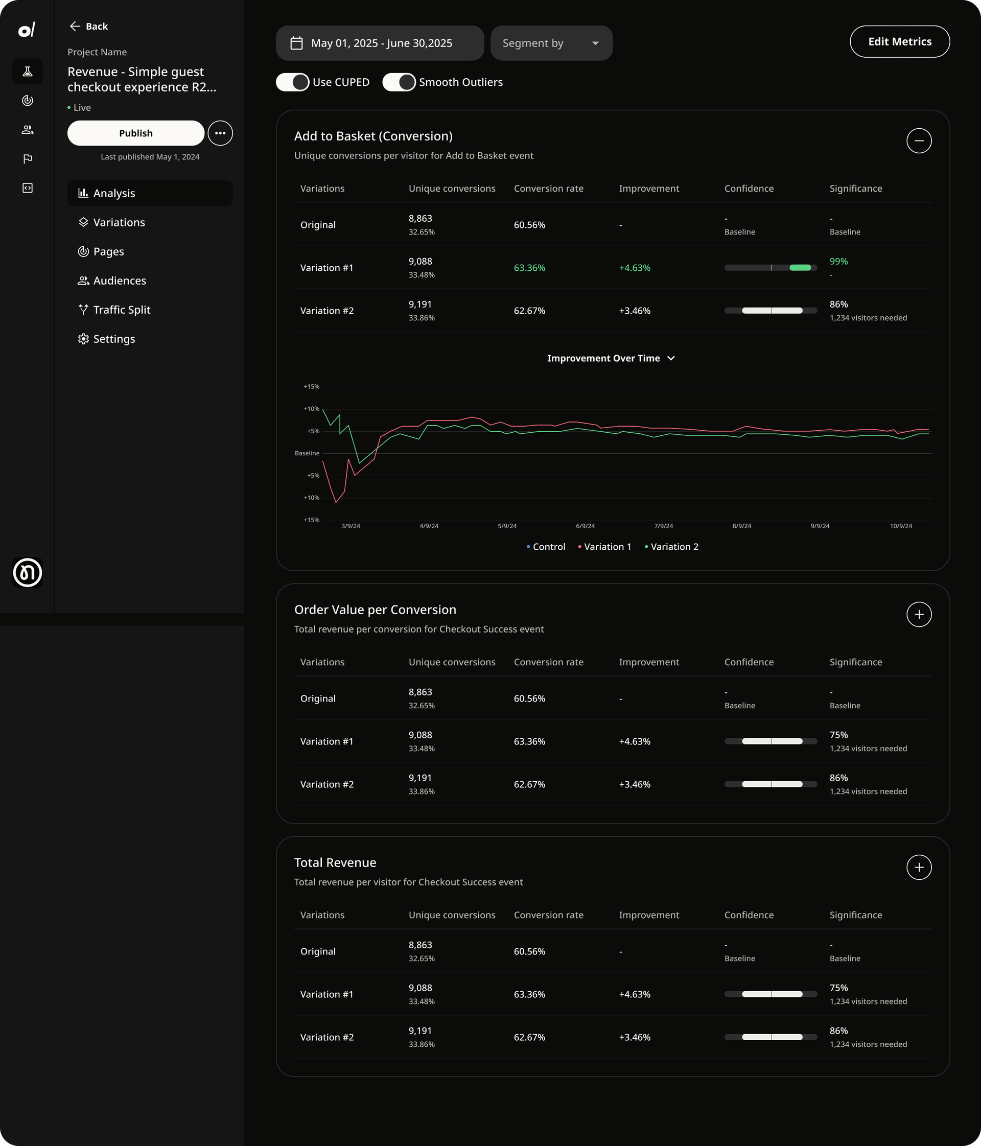
Developer-friendly interface.The dark UI is a reflection of how developers work, and where they spend their time. From infrastructure to interface, everything about Oboe was engineered to reduce drag and accelerate learning.


Built with solutions. We designed the UI to get out of the way. Dark mode by default, scannable layouts, and zero unnecessary clicks.