Hey there, fellow designers and developers! I want to share some thoughts on a topic that’s critical to our digital products’ success: trust and transparency. In an age where users are more concerned about their data privacy and security than ever, we must prioritize building trust and transparency into our digital products. In this blog post, I’ll discuss some strategies to help you do just that.
The Importance of Trust and Transparency
Building trust with users - Trust is the foundation of any successful product-user relationship. When users trust our digital products, they’re more likely to engage with them, recommend them to others, and become loyal customers.
Demonstrating transparency - Transparency is a key aspect of building trust. When we’re transparent about how our products work and how we handle user data, we empower users to make informed decisions and feel more confident about using our products.
Strategies for Building Trust and Transparency
Clear and concise communication
- Use simple language and avoid jargon to ensure users understand your product’s features and functionality.
- Make sure your privacy policies, terms of service, and consent agreements are easy to read and understand.
Visible and accessible information
- Display essential information, such as privacy policies and data usage details, prominently on your product’s interface.
- Provide easy-to-find resources, like FAQs or help articles, to assist users in understanding your product.
Data privacy and security measures
- Implement strong security measures to protect user data and comply with relevant data protection laws.
- Be transparent about data collection practices and give users control over
Experience at first hand
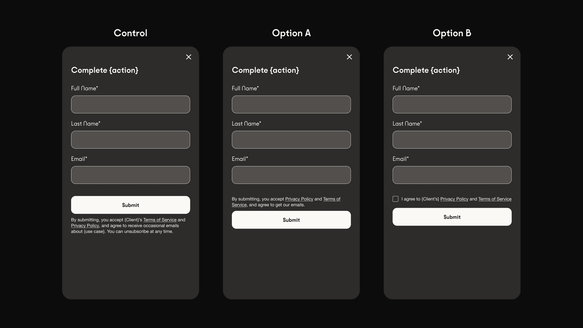
Let’s put a few of the above principles into practice. Below, I am referencing work that we have done for one of our clients. *I removed specific client references to protect our client. The goal was to improve transparency and reduce the legal risk; all while ensuring that conversion remains the same. This is a good reminder that good user experience is not only good for the user but also for the business.
The above variations show varying levels of transparency as well as legal protection. While ClickWrap (Right) offers the strongest legal protection (users actively have to agree to terms), it also adds the most friction and can therefore hurt conversion. Despite testing various copy directions, Option B ended up being a -5% hit on conversion. Option A ended up being a good compromise. Its simplified copy direction reduces the cognitive load while keeping additional friction minimal. It remained a -1% hit on conversion but the added benefits for user experience as well as legal risk made it all the worth it.


